
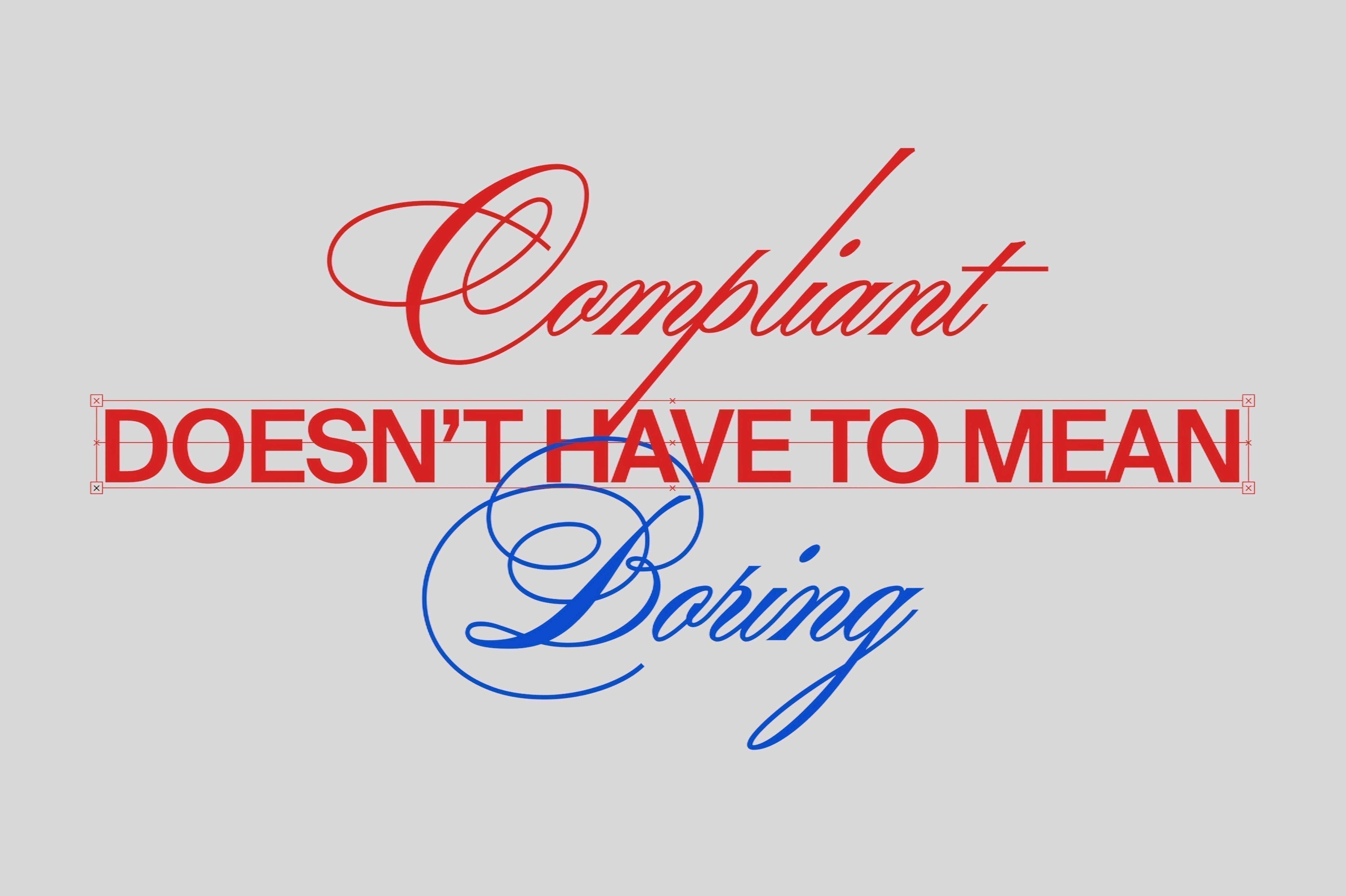
Compliant Doesn’t Have To Mean Boring
There is a myth in cannabis that compliance killed creativity.
It is a convenient story. It lets brands off the hook. If the regulators took away all the fun, then nobody is to blame for the uniform sea of earth tones, warning labels, and joyless sans-serif fonts that dominate dispensary shelves.
But the story is not true.
Regulated categories have always found ways to be brilliant.
Pharmaceutical packaging cannot make health claims.
Tobacco packaging must carry graphic warnings.
Alcohol labeling is governed by federal agencies.
Beauty products navigate an alphabet soup of ingredient restrictions and country-by-country regulations. And yet we have Aesop. We have Marlboro’s iconic red and white. We have Dom Perignon. We have the entire prestige skincare industry. Constraint is not the enemy of design. Laziness is.
What compliance actually takes away.
Let us be honest about what the rules actually restrict. In most regulated cannabis markets, you cannot make health claims. You cannot market to minors. You cannot use certain descriptors. You need specific text in specific sizes on specified surfaces.
That is not nothing. But it is also not a death sentence for brand expression.
Compliance governs what you say and where certain text must appear. It does not govern your color palette. It does not govern your structural packaging format. It does not govern your illustration style, your typography hierarchy, your material choice, your texture, your insert card, your unboxing ritual, or the emotional register of your entire brand.
The rules take a slice. Most brands act like the rules took everything.
Hierarchy is the weapon.
The best compliance-era design does not try to hide the required text. It uses visual hierarchy to make the brand communication feel primary and the regulatory copy feel secondary.
This is not about making the warning label invisible. It is about making everything else so confidently designed that the required elements sit in their correct proportion to the total visual experience.
A bold, well-chosen color occupies space. A distinctive structural format commands attention. An illustration that covers three sides of a box makes a consumer forget that the fourth side has compliance copy on it.
The warning does not define the package. The design defines the package. The warning is just part of it.
Structure, material, and format as brand statements.
Some of the most powerful brand statements in cannabis do not come from what is printed on the surface. They come from the surface itself.
The weight of a glass jar. The feel of a matte soft-touch tin. The click of a magnetic closure. The smell of a cedar-lined box when it opens. These are brand experiences that no warning label can take away.
When a brand invests in the structural and tactile experience of its packaging, compliance recedes. The customer is not reading the label first. They are feeling the product first. By the time they see the required text, they already know how the brand wants them to feel.
Compliance lives on the surface. Brand lives in the experience.
The design vocabulary that remains.
Even on the most restricted surfaces, designers have an enormous toolkit.
Color is not regulated. The emotional difference between a cannabis brand that chooses dusty sage green and one that chooses deep cardinal red and black is not small. One says apothecary. One says confidence. Both are legal.
Typography is not regulated. The gap between a brand that uses a beautifully set serif and one that uses a generic sans is the gap between a brand that feels like craft and a brand that feels like a spreadsheet.
Illustration is not regulated. Original artwork gives packaging a reason to be looked at, collected, and kept.
Proportion is not regulated. How much of the surface is given to the brand mark versus the product name versus the required copy is a design decision with enormous brand impact.
The constraint eliminates some options. The design vocabulary that remains is still vast.
Compliance is the brief. Design is the answer.
The best designers do not ask what the compliance rules allow. They ask what they can build within them. That distinction matters. The first question leads to checking boxes. The second leads to building brands. The cannabis brands that will be remembered a decade from now are not the ones that complained about the rules. They are the ones that understood the rules, accepted the brief, and then did something remarkable within it.
The warning label is not your brand.
Everything around it is.


